Every new care product risked duplicating effort.
Separate apps and dashboards were increasing the cost of maintaining patterns, quality and consistency.
A shared product vision and modular design system for a growing family of patient apps and clinical dashboards.
More products made separate design foundations harder to sustain.
Aligned stakeholders around a shared product vision and modular Figma system.
A reusable foundation across apps and brands; outcomes documented qualitatively.
Separate apps and dashboards were increasing the cost of maintaining patterns, quality and consistency.
I proposed a shared technical and design base that could flex across disease areas and product brands.
I led a team of more than six designers and brought product, technology and data into recurring workshops and sprint decisions.
The implemented system created a common baseline for apps, dashboards and future brands; documented impact is qualitative.
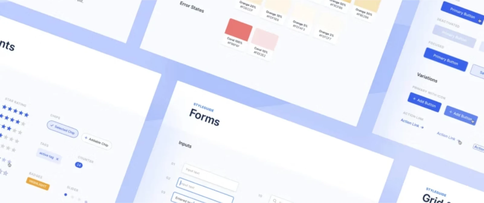
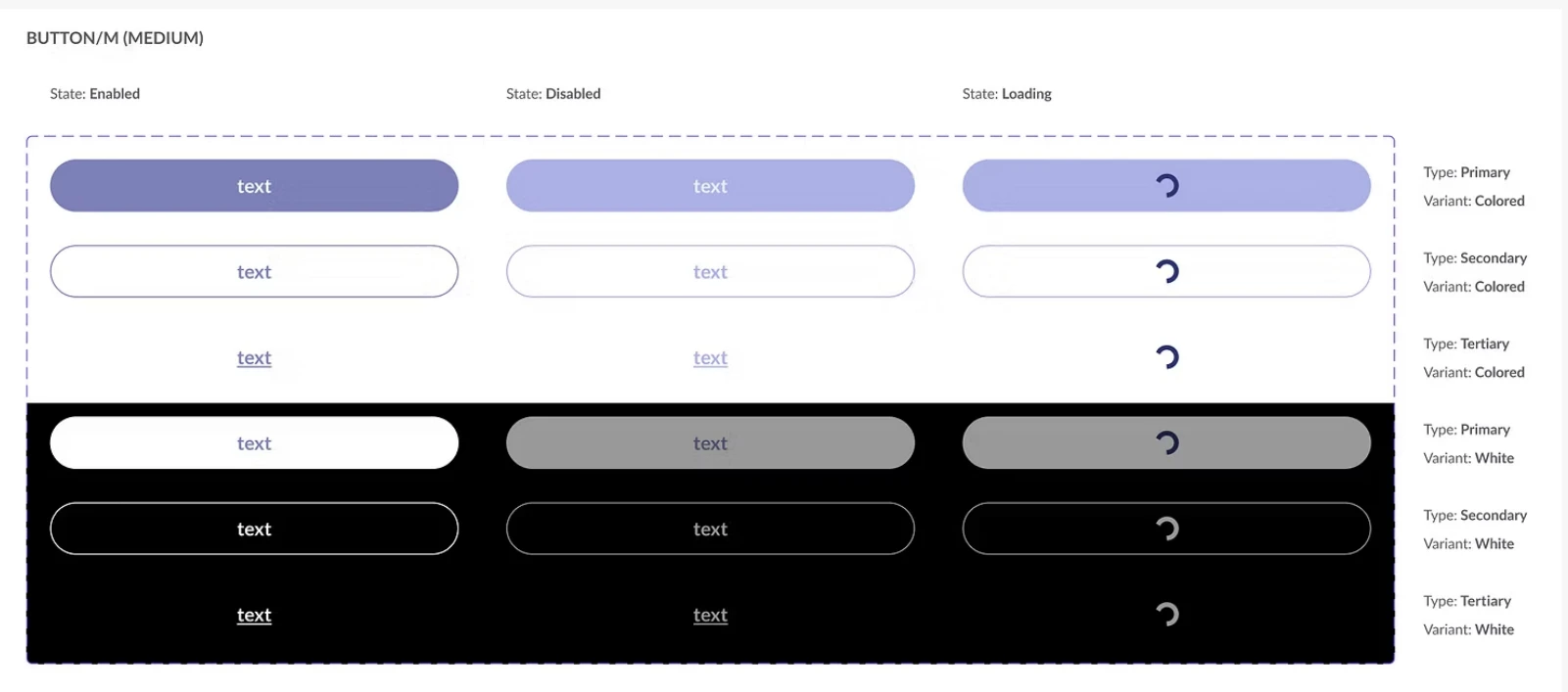
The system separated reusable interaction patterns from product-specific themes. That allowed teams to share the expensive foundations — structure, states and behaviour — while preserving the needs and identity of each care experience.
Florio was moving from an initial app towards multiple native apps for different disease areas, alongside dashboards for healthcare professionals. Designing and maintaining each product independently would become increasingly difficult as the portfolio grew.
I proposed a unified design system and a shared technical foundation that could support many patient apps and distinct clinical dashboards. The original vision described capacity for 10+ apps; that was the intended scale, not a claim that ten products had launched.
I led UX strategy and design across the apps and web dashboard, bringing business and user needs together. I also grew and led a team of more than six UX designers and established tools and processes for consistent delivery.
I brought design, technology, data and product stakeholders into design-thinking workshops. Together we aligned goals, mapped primary journeys and key screens, explored ideas and prioritised features. Workshops at the start of sprints kept the teams aligned as the experience evolved.
The modular Figma library supported consistent components and product-specific styling. Its structure allowed a new brand to reuse the foundation and adapt core colours. The work connected interface patterns, accessibility considerations and implementation needs across the portfolio.
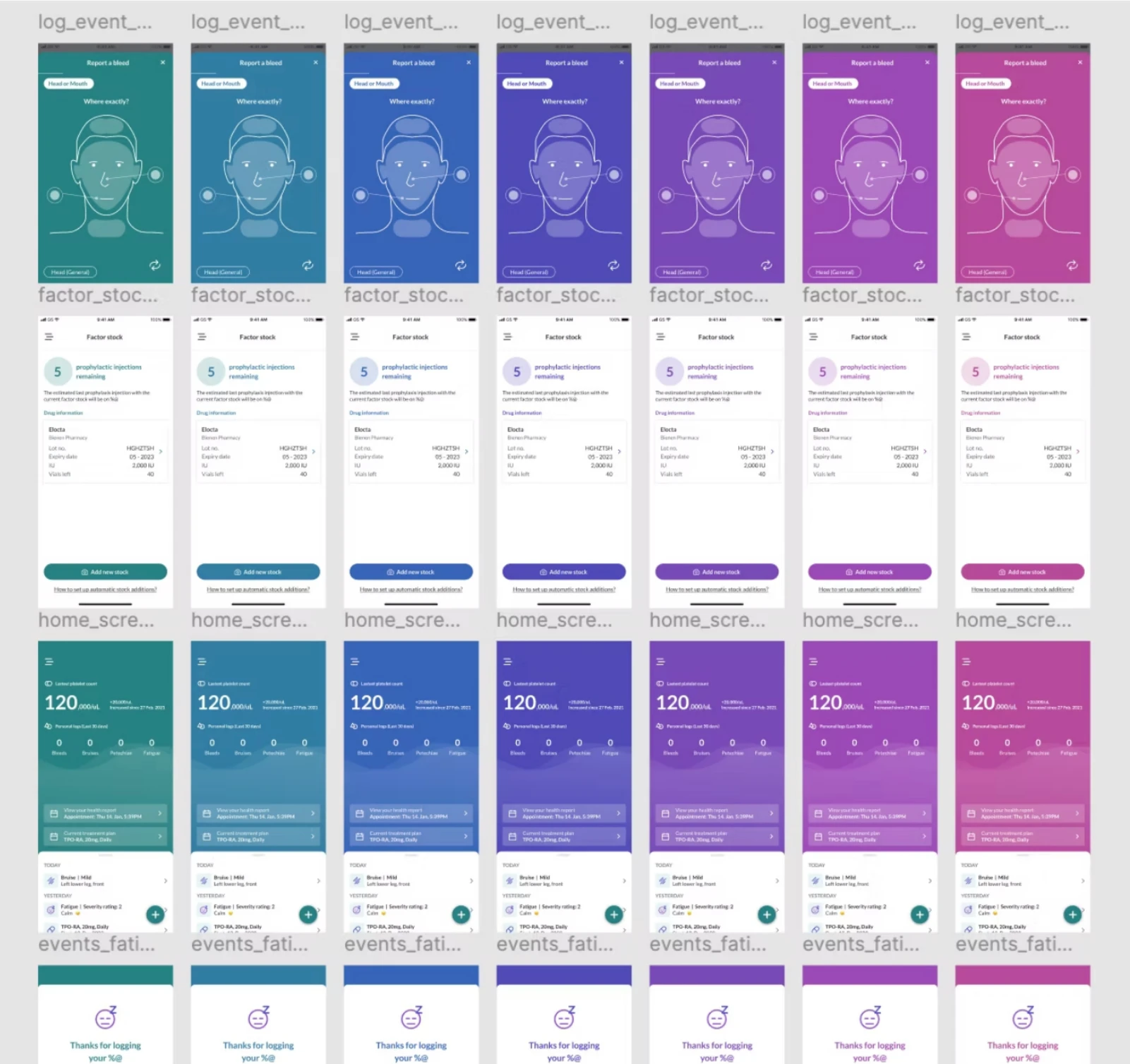
The original case study describes a more cohesive experience across products and a reusable baseline for further apps and brands. The documented outcomes are qualitative: consistency, reuse and more efficient design and development.