Making mobile payment feel simple.
Integrating payment into a familiar loyalty app across iOS, Android, retailers and technical constraints.
Payment needed to fit a familiar app and multiple retail technologies.
Worked across strategy, concepts, UX/UI, specifications and repeated usability testing.
Nearly 24% of monthly active app users adopted the feature, as reported in the original case study.
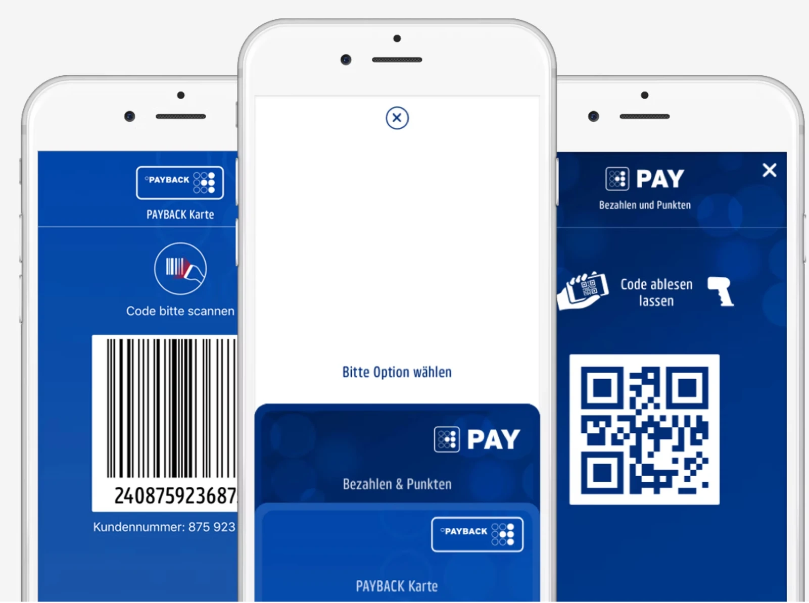
A simple checkout, a complex technical context
Introduce a highly visible, easy-to-use payment feature inside the existing PAYBACK app. The experience had to work across multiple retailers and technologies while fitting an established, already complex product.
Shaping the experience from strategy to detail
My work covered strategy, goals and objectives, concept development, UI and UX design, and specifications. The central design task was to simplify the payment journey while respecting the brand and platform constraints.
Understanding behaviour at the payment moment
Interviews and research examined how people felt about mobile payments, how existing payment methods worked, and what users and competing solutions could teach us. These findings informed a consistent concept for both iOS and Android.
Making payment feel like part of PAYBACK
We refined the experience through repeated usability testing. Interface design, micro-interactions and transitions helped make the feature recognisable within PAYBACK while reducing confusion during checkout.
Testing with shoppers in a simulated supermarket
A final three-day usability study used a simulated supermarket. Participants shopped and paid with PAYBACK PAY, allowing the team to identify remaining obstacles and iterate the high-fidelity designs.
Nearly 24% reported feature adoption
The original case study reports that nearly 24% of PAYBACK monthly active app users used the payment feature after launch. The measurement window is not specified.